BRAND "AUTOMO"
AUTOMO
BRAND "AUTOMO"
Built for Connected Workflows
Built for Connected Workflows

INDUSTRY
TECH
PROFESSIONAL SERVICES
Client
AUTOMO
Services
LOGO DESIGN
VISUAL IDENTITY DESIGN
BRAND IDENTITY DESIGN
Year
2026
Info
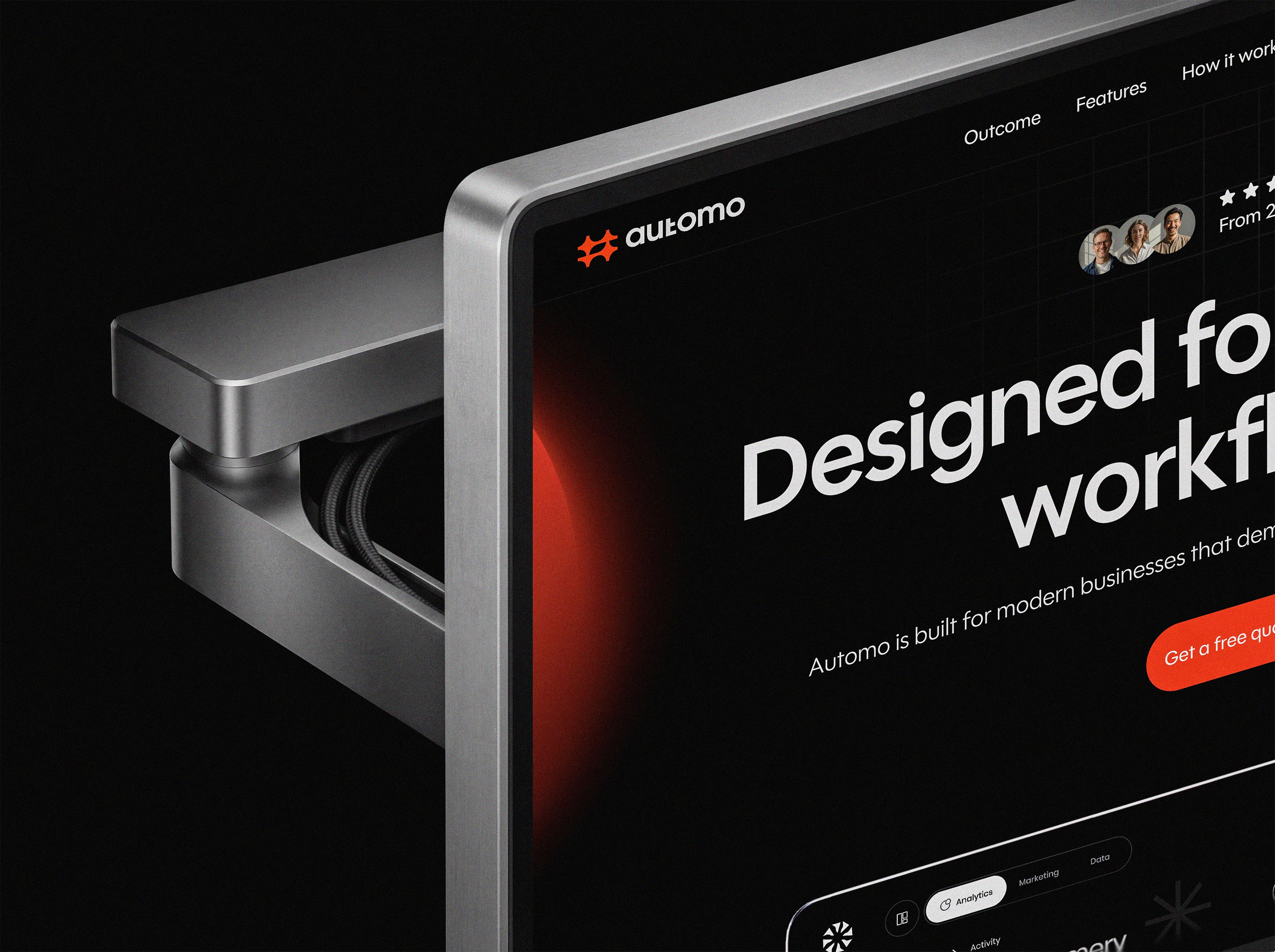
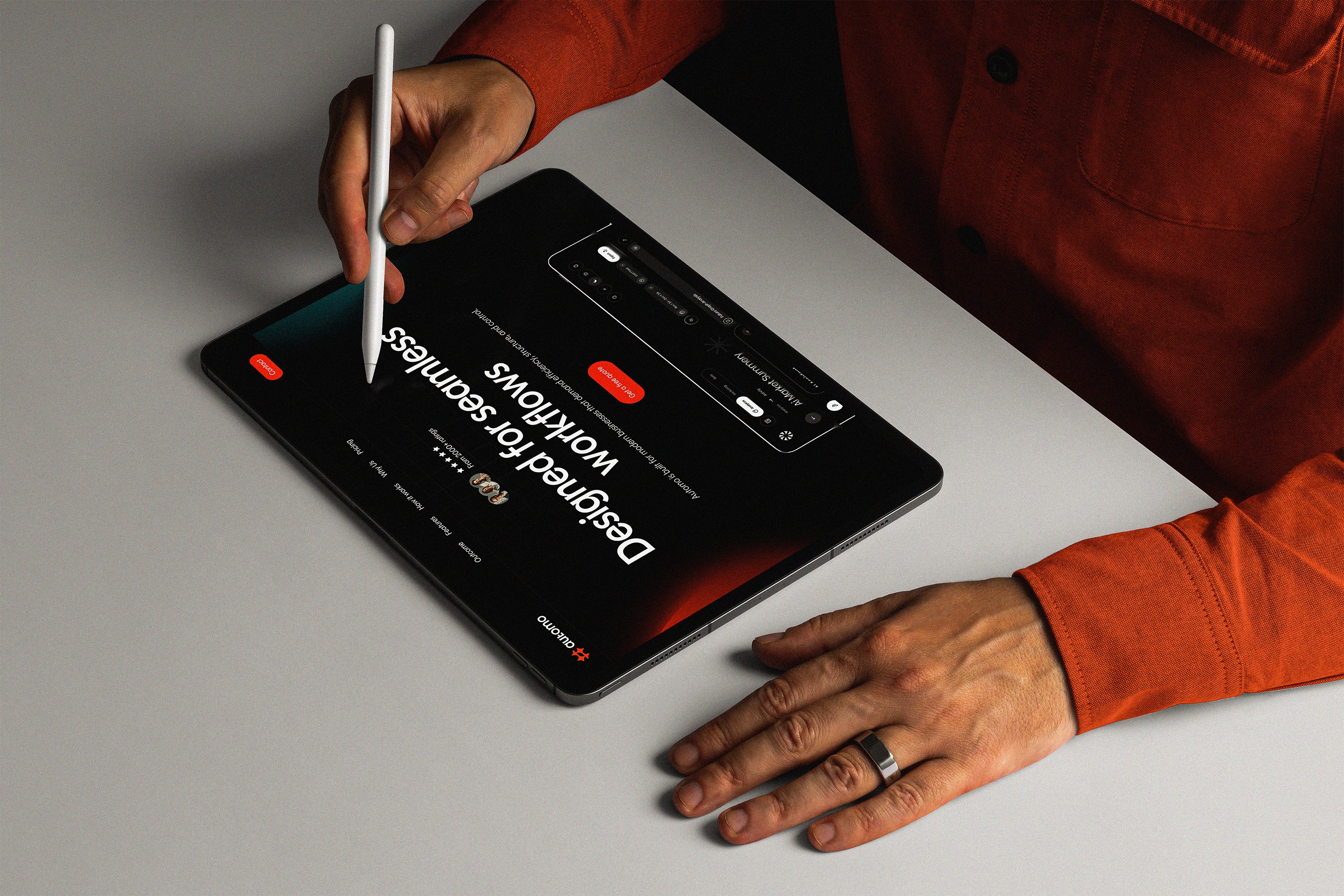
Automo is a modern B2B SaaS workflow and integration platform built to help businesses simplify operations by connecting tools, automating workflows, and creating seamless collaboration across teams. As organizations adopt more software, fragmented systems and manual processes become barriers to productivity. Automo addresses this challenge by bringing everything together into one connected ecosystem where workflows move effortlessly and information flows without interruption.
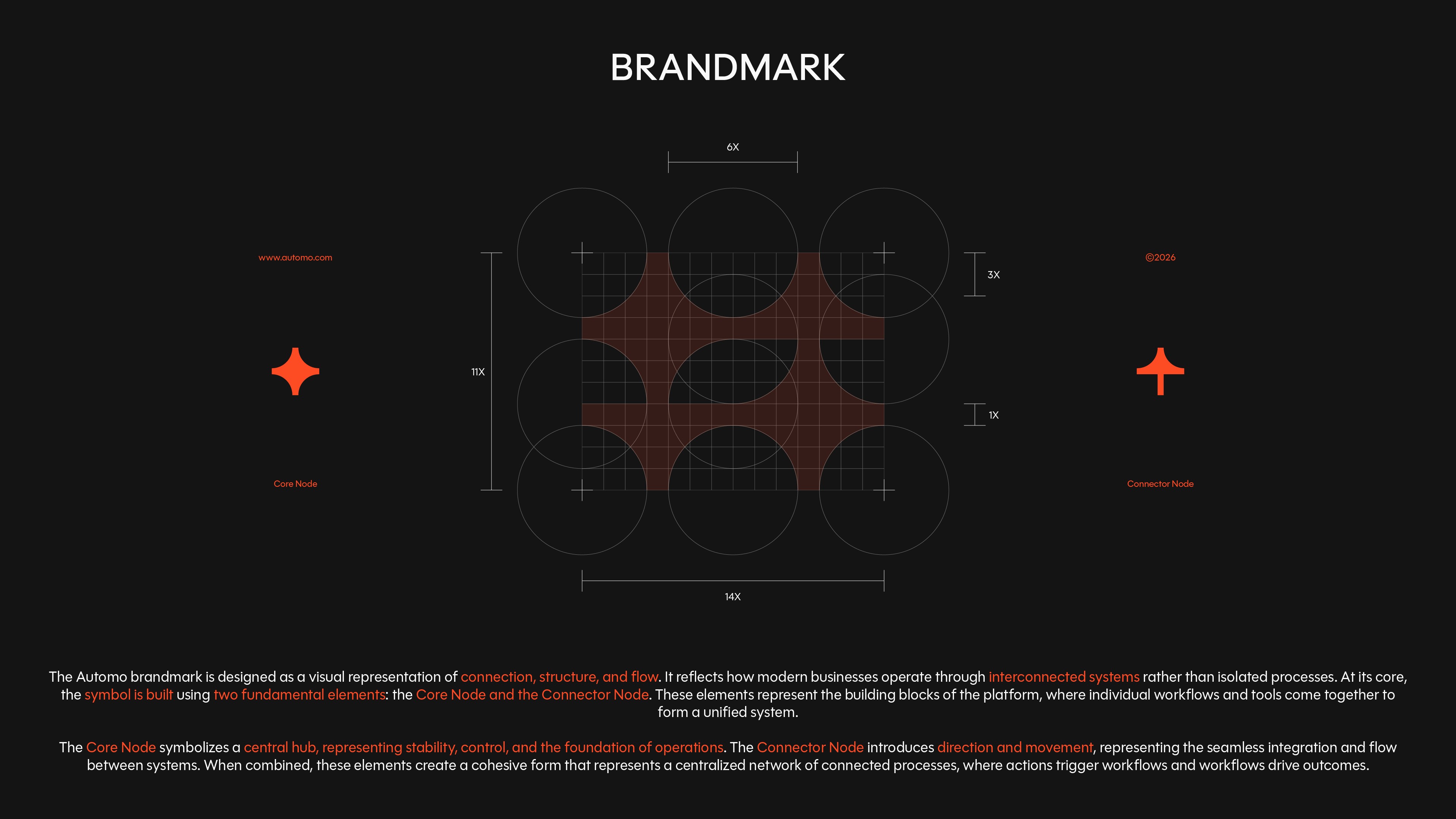
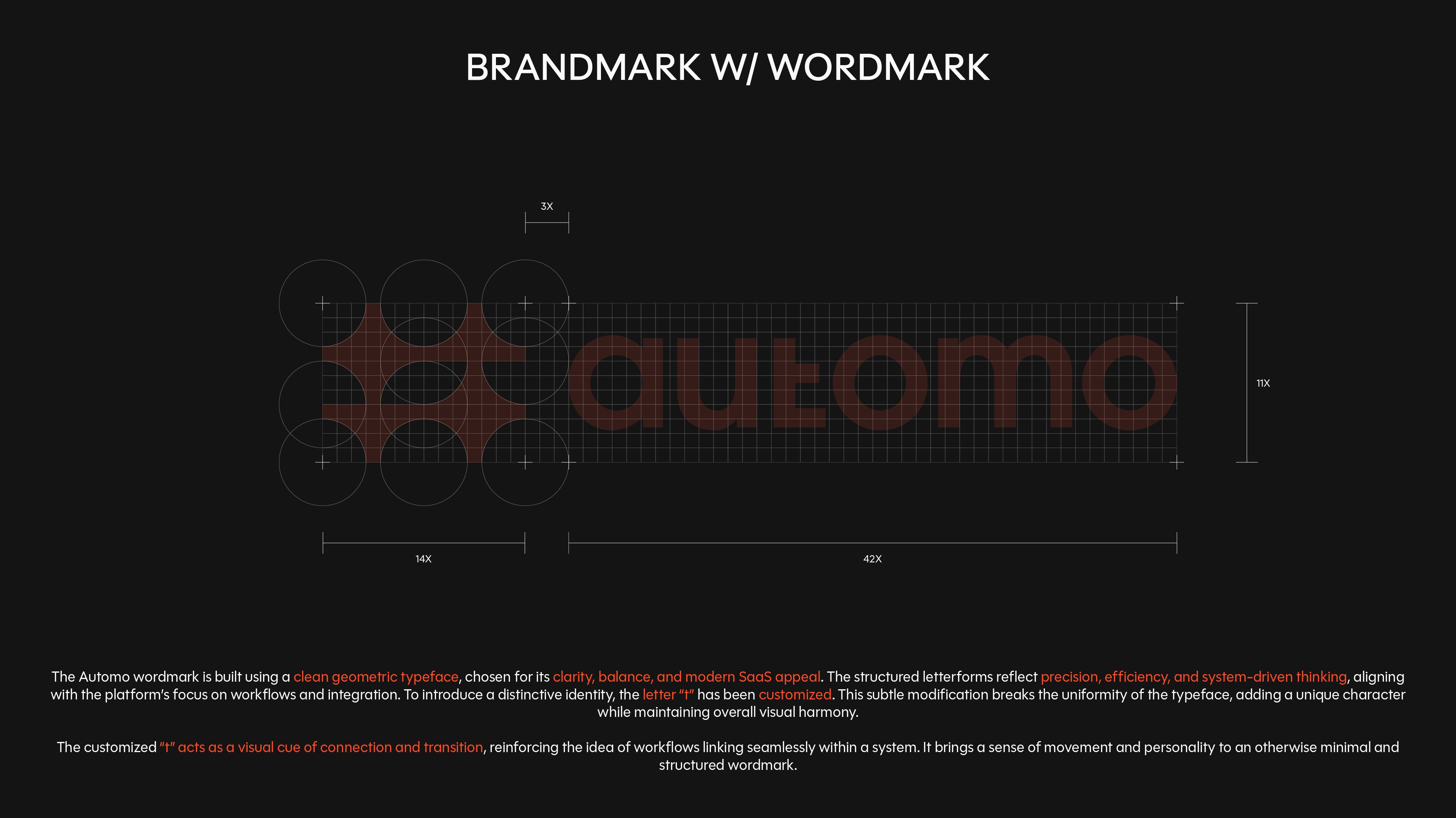
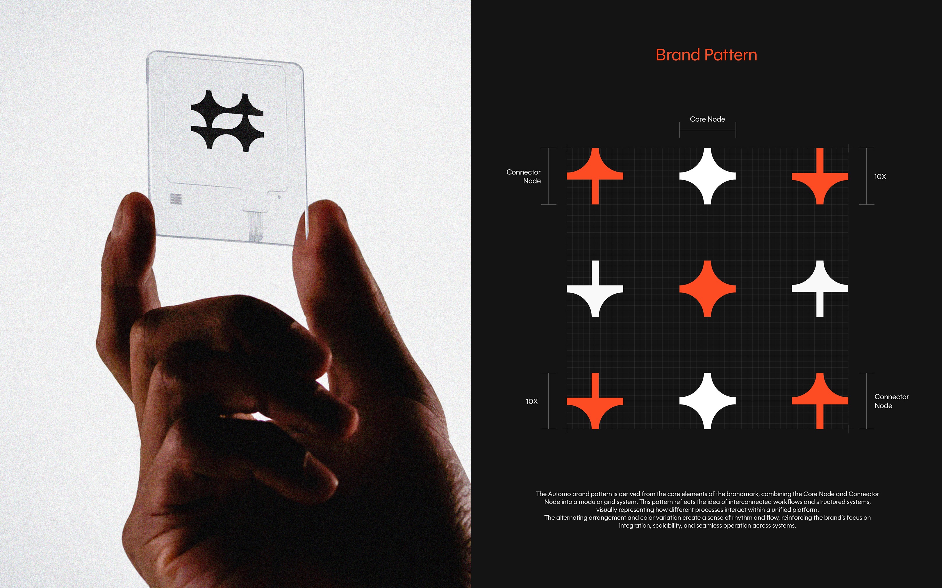
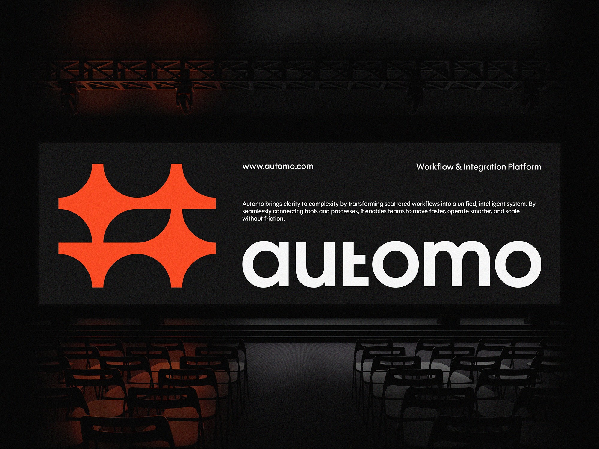
The identity is inspired by the principles of connection, structure, and flow. At its core is a modular brandmark built from interconnected nodes, symbolizing how independent tools and processes come together as one unified system. Paired with a custom geometric wordmark, a refined typographic system, and a bold yet minimal color palette, the identity creates a scalable visual language that reflects clarity, efficiency, and modern business operations.
Automo is a modern B2B SaaS workflow and integration platform built to help businesses simplify operations by connecting tools, automating workflows, and creating seamless collaboration across teams. As organizations adopt more software, fragmented systems and manual processes become barriers to productivity. Automo addresses this challenge by bringing everything together into one connected ecosystem where workflows move effortlessly and information flows without interruption.
The identity is inspired by the principles of connection, structure, and flow. At its core is a modular brandmark built from interconnected nodes, symbolizing how independent tools and processes come together as one unified system. Paired with a custom geometric wordmark, a refined typographic system, and a bold yet minimal color palette, the identity creates a scalable visual language that reflects clarity, efficiency, and modern business operations.


BRAND STORY
Modern businesses rely on dozens of digital tools to manage projects, communicate with teams, organize data, and automate everyday operations. While these tools improve productivity individually, they often create disconnected workflows that require constant manual effort to keep everything in sync.
Automo was born from the idea that work should move as one connected system, not as isolated tasks spread across multiple platforms. The vision was to create a platform that simplifies complexity by bringing workflows, integrations, and automation together into a single, intuitive experience.
This philosophy became the foundation of the brand itself. Every element of the identity reflects the way Automo operates. The modular brandmark represents connected nodes working together within a unified system, while the custom wordmark introduces a subtle sense of movement that reflects continuous workflow. The visual language is intentionally minimal, structured, and scalable, mirroring the platform's purpose of turning complex operations into seamless experiences.

The Challenge
As businesses adopt more software to manage daily operations, workflows often become fragmented across multiple platforms. This creates unnecessary complexity, slows down collaboration, and makes automation feel overwhelming. The challenge was to create a brand identity that communicates simplicity, connection, and efficiency while standing apart from the generic visual language commonly found in the B2B SaaS industry.
As businesses adopt more software to manage daily operations, workflows often become fragmented across multiple platforms. This creates unnecessary complexity, slows down collaboration, and makes automation feel overwhelming. The challenge was to create a brand identity that communicates simplicity, connection, and efficiency while standing apart from the generic visual language commonly found in the B2B SaaS industry.
The Strategy
The strategy focused on reducing complexity into a clear and memorable visual system. Rather than relying on conventional technology symbols, the identity was built around the concept of connected workflows. Every design decision was guided by the principles of structure, modularity, and flow, creating a system that reflects how Automo seamlessly integrates tools and automates business processes.
The strategy focused on reducing complexity into a clear and memorable visual system. Rather than relying on conventional technology symbols, the identity was built around the concept of connected workflows. Every design decision was guided by the principles of structure, modularity, and flow, creating a system that reflects how Automo seamlessly integrates tools and automates business processes.

The Solution
The identity centers around a modular brandmark constructed from interconnected nodes, symbolizing the movement of information and the relationship between systems. A customized geometric wordmark introduces a subtle sense of movement while maintaining clarity and readability. Supported by a bold color palette, structured typography, and a flexible pattern system, the identity creates a scalable visual language that adapts consistently across digital products, marketing, and brand communications.
The identity centers around a modular brandmark constructed from interconnected nodes, symbolizing the movement of information and the relationship between systems. A customized geometric wordmark introduces a subtle sense of movement while maintaining clarity and readability. Supported by a bold color palette, structured typography, and a flexible pattern system, the identity creates a scalable visual language that adapts consistently across digital products, marketing, and brand communications.
Target Audience Alignment
The brand identity was designed to make sophisticated technology feel approachable and easy to understand. Clean geometric forms, high-contrast colors, and a structured layout system communicate reliability, precision, and confidence. This creates trust with startups, growing businesses, and enterprise teams by presenting automation as something intuitive rather than complicated.
The brand identity was designed to make sophisticated technology feel approachable and easy to understand. Clean geometric forms, high-contrast colors, and a structured layout system communicate reliability, precision, and confidence. This creates trust with startups, growing businesses, and enterprise teams by presenting automation as something intuitive rather than complicated.


The Outcome
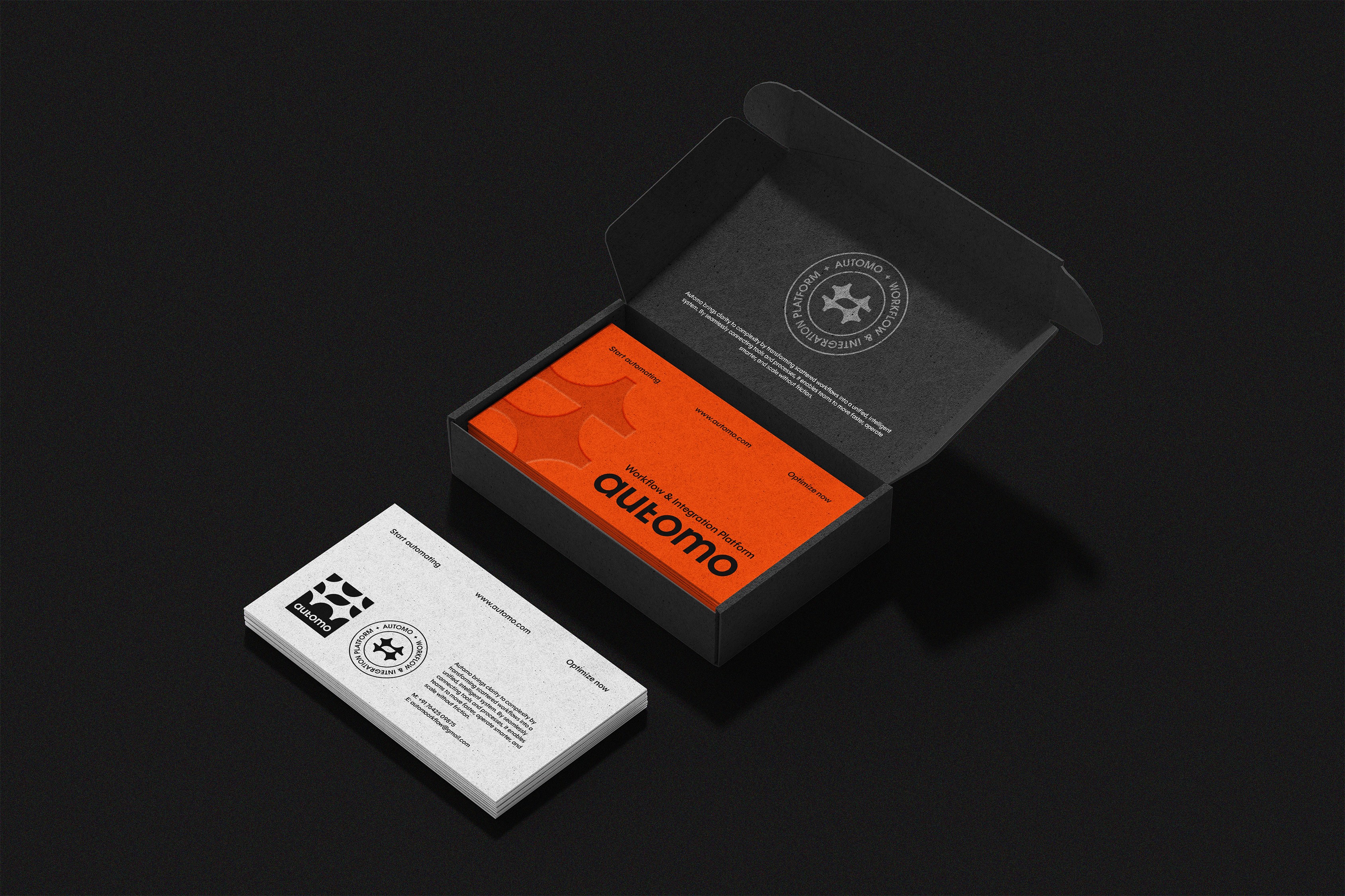
Automo evolved into a cohesive identity system that extends far beyond a logo. Every visual element, from the brandmark and wordmark to the pattern system and supporting assets, reinforces the core idea of connected workflows. The result is a modern, scalable identity that clearly communicates the platform's purpose while establishing a distinctive and recognizable presence within the B2B SaaS space.
Automo evolved into a cohesive identity system that extends far beyond a logo. Every visual element, from the brandmark and wordmark to the pattern system and supporting assets, reinforces the core idea of connected workflows. The result is a modern, scalable identity that clearly communicates the platform's purpose while establishing a distinctive and recognizable presence within the B2B SaaS space.


Every brand brings its own ambitions, challenges, and complexities. What remains constant is the process of uncovering what makes it distinctive and translating that into an identity with purpose. The next project offers a different perspective, a different story, and a new set of decisions that shaped the outcome. Explore the thinking behind the work and discover how strategy informed every detail.
Every brand brings its own ambitions, challenges, and complexities. What remains constant is the process of uncovering what makes it distinctive and translating that into an identity with purpose. The next project offers a different perspective, a different story, and a new set of decisions that shaped the outcome. Explore the thinking behind the work and discover how strategy informed every detail.


Every brand brings its own ambitions, challenges, and complexities. What remains constant is the process of uncovering what makes it distinctive and translating that into an identity with purpose. The next project offers a different perspective, a different story, and a new set of decisions that shaped the outcome. Explore the thinking behind the work and discover how strategy informed every detail.